The principles of a neurodiverse website
A movement that began in the 1990s, neurodiversity has experienced a swell of support in recent years and it has never been more popular than it is today. For marketers, it means making websites accessible for everyone.
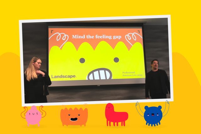
Our Creative Director Ryan Sales recently spoke to Pensions Age about tailoring pensions communications to neurodiverse people — websites in particular. Ryan alluded to the importance of embedding best practices from planning, design and build all the way through to user testing. At Landscape, we’re passionate about building websites that are diverse and inclusive from the get-go and we do this by focusing on several fundamental principles…
Colours and contrast
Living Autism suggests using softer, milder colours for neurodiverse web design. We’ll always take this into consideration during the design phase, opting for greens, browns, greys and tans over harsh reds, yellows and whites, which are considered to be too intense for this audience.
Typography
When it comes to catering to neurodiverse audiences, your choice of typography is more important than you think.
The British Dyslexia Association suggests using sans serif fonts like Arial, Verdana, Open Sans and even — the enemy of designers everywhere — Comic Sans. With serifs however, certain letters are harder to differentiate, particularly pairs of d and b as well as p and q. Font size and character spacing are also worth paying attention to — Scope recommends a font size between 12-14 and an inter-character spacing of 35%.
Language
For copywriters, it’s best to leave some tools in your toolbox, because the perfect accompaniment to good typography is plain, easy-to-understand language. This means avoiding figures of speech, idioms and even metaphors, as those who fall on the autism spectrum often struggle to understand them. Ryan alludes to in his comments to Pension Age: “Pensions are often complex, so use simple, straightforward and unambiguous language. It’s best to avoid idioms and ambiguous phrasing.”
We also recommended using the active voice and keep your paragraphs short and sweet. Longer paragraphs are visually imposing and an instant turn off for those with shorter attention spans.
All our website and portals are independently tried and tested with various conditions including dyslexia, blindness and Autism Spectrum Disorder. This allows us to identify any potential issues before launch and further ensure inclusive and accessible communications.
Follow us on LinkedIn to stay up to date on all things Landscape.